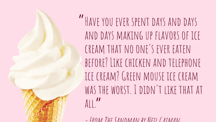
A simple example of “CSS Shapes” (i.e. the shape-outside property) in action with some text.
Author Adrian Payne
Created SEPTEMBER 14, 2018
License Open
Compatible browsers Chrome, Firefox, Safari
HTML Snippet
`<div class="quote"> <img src="https://s3-us-west-2.amazonaws.com/s.cdpn.io/62105/icecream.png" alt="icecream" class="icecream" /> <blockquote class="text">Have you ever spent days and days and days making up flavors of ice cream that no one's ever eaten before? Like chicken and telephone ice cream? Green mouse ice cream was the worst. I didn't like that at all.</blockquote> <cite class="citation">- From The Sandman by Neil Gaiman</cite> </div>`CSS Code
`@charset "UTF-8"; @import url("https://fonts.googleapis.com/css?family=Amatic+SC:400"); html, body { height: 100%; } body { background-color: #ffdce8; color: #5d0020; font-family: "Amatic SC", cursive; overflow: hidden; } .quote { height: 400px; overflow: hidden; position: absolute; left: 50%; margin-left: -350px; bottom: 0; width: 700px; } .icecream { float: left; shape-outside: url(https://s3-us-west-2.amazonaws.com/s.cdpn.io/62105/icecream.png); height: 100%; } .text { font-size: 42px; margin: 0; padding-left: 20px; padding-top: 20px; } .text::before, .text::after { font-size: 80px; position: absolute; } .text::before { content: "â"; margin-top: -15px; margin-left: -25px; } .text::after { content: "â"; margin-top: -10px; margin-left: -5px; } .citation { font-size: 32px; top: 20px; position: relative; }`