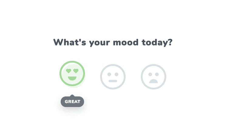
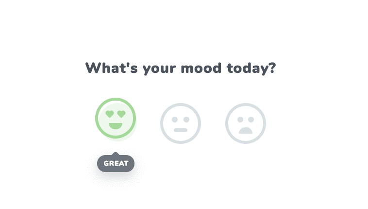
Micro-Interactions with emoji faces. Beautiful animated (What’s Your Mood Today) Reaction icon developed using HTML, CSS and JavaScript.
Author Himalaya Singh
Created SEPTEMBER 17, 2018
License Open
Compatible browsers Chrome, Firefox, Safari
HTML Snippet
`<div id="app-cover"> <h1>What's your mood today?</h1> <div id="app"> <div class="mood" id="mood-great"> <div class="face"> <div class="eyes-cover"> <div class="eye"></div> <div class="eye"></div> </div> <div class="mouth"></div> </div> <div class="mood-name"><span>great</span></div> </div> <div class="mood" id="mood-okay"> <div class="face"> <div class="eyes-cover"> <div class="eye"></div> <div class="eye"></div> </div> <div class="mouth"></div> </div> <div class="mood-name"><span>okay</span></div> </div> <div class="mood" id="mood-bad"> <div class="face"> <div class="eyes-cover"> <div class="eye"></div> <div class="eye"></div> </div> <div class="mouth"></div> </div> <div class="mood-name"><span>bad</span></div> </div> </div> </div> <div class="action-btn" id="play-pause">Pause / Play auto animation</div> <div class="action-btn" id="clear">Delete auto animation</div>`CSS Code
`* { outline: none; } html, body { height: 100%; min-height: 100%; } body { margin: 0; font-family: Nunito; } #app-cover { position: absolute; top: 50%; right: 0; left: 0; width: 402px; margin: -85px auto 0 auto; } h1 { color: #4b525b; font-size: 30px; text-align: center; letter-spacing: 1px; line-height: 1; margin: 0 0 31px 0; } #app:after { content: ''; display: table; clear: both; } .mood { position: relative; top: 0; width: 84px; height: 84px; float: left; padding: 25px; transition: 0.5s ease top; cursor: pointer; } .mood.active, .mood:hover { top: -20px; } .mood:after { content: ''; position: absolute; top: 36px; left: 32px; width: 79px; height: 79px; background-color: #fff; border-radius: 50%; transition: 0.3s ease background-color; z-index: -1; } #mood-great.active:after, #mood-great:hover:after { background-color: #ebf7e8; } #mood-okay.active:after, #mood-okay:hover:after { background-color: #f1f3f4; } #mood-bad.active:after, #mood-bad:hover:after { background-color: #fde4e3; } .face { position: relative; height: 72px; border: 6px solid #d9e0e3; border-radius: 50%; } .eyes-cover { position: relative; top: 22px; } #mood-great .eyes-cover { top: 25px; } .eye { position: absolute; width: 12px; height: 12px; background-color: #d9e0e3; border-radius: 50%; } .eye:first-child { left: 18px; } .eye:last-child { right: 18px; } #mood-great .eye { width: 8px; height: 8px; -webkit-transform: rotateZ(-45deg) scale(1); transform: rotateZ(-45deg) scale(1); border-radius: 0; } #mood-great .eye:first-child { left: 20px; } #mood-great .eye:last-child { right: 20px; } #mood-bad .eye:first-child { left: 19px; } #mood-bad .eye:last-child { right: 19px; } #mood-great .eye:before, #mood-great .eye:after { content: ''; position: absolute; display: block; width: 8px; height: 8px; background-color: #d9e0e3; border-radius: 50%; } #mood-great .eye:before { top: -4px; left: 0; } #mood-great .eye:after { top: 0; right: -4px; } .mouth { position: absolute; top: 46px; right: 0; left: 0; width: 28px; margin: 0 auto; background-color: #d9e0e3; } #mood-great .mouth, #mood-bad .mouth { height: 13px; border-radius: 0 0 40px 40px; } #mood-okay .mouth { height: 8px; margin-left: 22px; border-radius: 10px; } #mood-bad .mouth { top: 44px; -webkit-transform: rotateZ(180deg); transform: rotateZ(180deg); } .face, .eyes-cover, .eye, #mood-great .eye:before, #mood-great .eye:after, .mouth { transition: 0.3s ease all; } .mood-name { position: absolute; left: 0; right: 0; bottom: -70px; color: #fff; font-size: 14px; text-align: center; padding: 8px 14px; margin: 0 auto; text-transform: uppercase; opacity: 0; background-color: #4b525b; border-radius: 20px; box-shadow: 0 10px 35px #cacbcf; transition: 0.3s ease bottom, 0.3s ease opacity; } .mood.active .mood-name, .mood:hover .mood-name { bottom: -40px; opacity: 1; } #mood-great .mood-name { width: 49px; } #mood-okay .mood-name { width: 41px; } #mood-bad .mood-name { width: 33px; } .mood-name span { position: relative; letter-spacing: 1px; background-color: #4b525b; z-index: 2; } .mood-name:before { content: ''; position: absolute; top: -5px; right: 0; left: 0; width: 16px; height: 16px; margin: 0 auto; background-color: #4b525b; border-radius: 5px; -webkit-transform: rotateZ(45deg); transform: rotateZ(45deg); z-index: 1; } #mood-great.active .face, #mood-great:hover .face { border-color: #9ad88b; } #mood-great.active .eye, #mood-great:hover .eye, #mood-great.active .eye:before, #mood-great:hover .eye:before, #mood-great.active .eye:after, #mood-great:hover .eye:after, #mood-great.active .mouth, #mood-great:hover .mouth { background-color: #9ad88b; } #mood-okay.active .face, #mood-okay:hover .face { border-color: #b1babe; } #mood-okay.active .eye, #mood-okay:hover .eye, #mood-okay.active .eye:before, #mood-okay:hover .eye:before, #mood-okay.active .eye:after, #mood-okay:hover .eye:after, #mood-okay.active .mouth, #mood-okay:hover .mouth { background-color: #b1babe; } #mood-bad.active .face, #mood-bad:hover .face { border-color: #f57a71; } #mood-bad.active .eye, #mood-bad:hover .eye, #mood-bad.active .eye:before, #mood-bad:hover .eye:before, #mood-bad.active .eye:after, #mood-bad:hover .eye:after, #mood-bad.active .mouth, #mood-bad:hover .mouth { background-color: #f57a71; } #mood-great.active .eye, #mood-great:hover .eye { -webkit-animation: great 0.7s linear; animation: great 0.7s linear; } #mood-okay.active .mouth, #mood-okay:hover .mouth { -webkit-animation: okay 0.9s linear 0.4s; animation: okay 0.9s linear 0.4s; } #mood-bad.active .eyes-cover, #mood-bad:hover .eyes-cover { -webkit-animation: bad_eyes 1s linear; animation: bad_eyes 1s linear; } #mood-bad.active .mouth, #mood-bad:hover .mouth { -webkit-animation: bad_mouth 1s linear ; animation: bad_mouth 1s linear ; } #mood-bad.active:after, #mood-bad:hover:after { -webkit-animation: bad_after 0.3s linear; animation: bad_after 0.3s linear; } @-webkit-keyframes great { 0% { -webkit-transform: rotateZ(-45deg) scale(1); transform: rotateZ(-45deg) scale(1); } 25% { -webkit-transform: rotateZ(-45deg) scale(1.3); transform: rotateZ(-45deg) scale(1.3); } 50% { -webkit-transform: rotateZ(-45deg) scale(1); transform: rotateZ(-45deg) scale(1); } 75% { -webkit-transform: rotateZ(-45deg) scale(1.3); transform: rotateZ(-45deg) scale(1.3); } 100% { -webkit-transform: rotateZ(-45deg) scale(1); transform: rotateZ(-45deg) scale(1); } } @keyframes great { 0% { -webkit-transform: rotateZ(-45deg) scale(1); transform: rotateZ(-45deg) scale(1); } 25% { -webkit-transform: rotateZ(-45deg) scale(1.3); transform: rotateZ(-45deg) scale(1.3); } 50% { -webkit-transform: rotateZ(-45deg) scale(1); transform: rotateZ(-45deg) scale(1); } 75% { -webkit-transform: rotateZ(-45deg) scale(1.3); transform: rotateZ(-45deg) scale(1.3); } 100% { -webkit-transform: rotateZ(-45deg) scale(1); transform: rotateZ(-45deg) scale(1); } } @-webkit-keyframes okay { 0% { width:28px; margin-left: 22px; } 25% { width:15px; margin-left: 24px; } 50% { width:15px; margin-left: 24px; } 75% { width:15px; margin-left: 24px; } 100% { width:28px; margin-left: 22px; } } @keyframes okay { 0% { width:28px; margin-left: 22px; } 25% { width:15px; margin-left: 24px; } 50% { width:15px; margin-left: 24px; } 75% { width:15px; margin-left: 24px; } 100% { width:28px; margin-left: 22px; } } @-webkit-keyframes bad_eyes { 0% { top: 22px; left: 0; } 25% { top: 24px; left: -7px; } 50% { top:24px; left: -7px; } 75% { top:24px; left: -7px; } 100% { top:22px; left: 0; } } @keyframes bad_eyes { 0% { top: 22px; left: 0; } 25% { top: 24px; left: -7px; } 50% { top:24px; left: -7px; } 75% { top:24px; left: -7px; } 100% { top:22px; left: 0; } } @-webkit-keyframes bad_mouth { 0% { top: 44px; left: 0; } 25% { top: 41px; left: -8px; } 50% { top:41px; left: -8px; } 75% { top:41px; left: -8px; } 100% { top:44px; left: 0; } } @keyframes bad_mouth { 0% { top: 44px; left: 0; } 25% { top: 41px; left: -8px; } 50% { top:41px; left: -8px; } 75% { top:41px; left: -8px; } 100% { top:44px; left: 0; } } @-webkit-keyframes bad_after { 0% { top:36px; left: 32px; } 25% { top:33px; left: 29px; } 50% { top:36px; left: 32px; } 75% { top:33px; left: 35px; } 100% { top:36px; left: 32px; } } @keyframes bad_after { 0% { top:36px; left: 32px; } 25% { top:33px; left: 29px; } 50% { top:36px; left: 32px; } 75% { top:33px; left: 35px; } 100% { top:36px; left: 32px; } } .action-btn { position: absolute; right: 20px; bottom: 20px; color: #fff; font-size: 14px; padding: 10px 12px; background-color: #4b525b; border-radius: 4px; cursor: pointer; z-index: 1; } .action-btn:active { -webkit-transform: translateY(2px); transform: translateY(2px); } #play-pause { bottom: 69px; } .action-btn.disabled { opacity: 0.2; cursor: auto; -webkit-transform: translateY(0); transform: translateY(0); }`JavaScript Snippet
`$(function() { var sToggle = 1,si, i = 0, count = 0, mood, moods = ['great','okay','bad']; function startAnimation() { si = setInterval(function() { mood = moods; $('#mood-'+mood).toggleClass('active'); if( (count % 2) != 0 ) { ++i; if( count == 5 ) { count = -1; i = 0; } } ++count; },1500); } startAnimation(); $('#play-pause').on('click',function() { if( sToggle ) { sToggle = 0; clearInterval(si); } else { sToggle = 1; startAnimation(); } }); $('#clear').on('click',function() { clearInterval(si); $('#play-pause, #clear').addClass('disabled'); $('.active').removeClass('active'); $('#play-pause').off('click'); $('#clear').off('click'); }); });`Preview