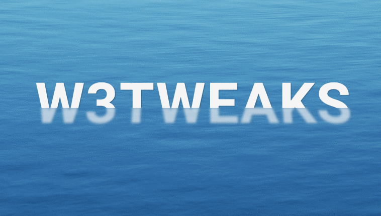
Refracted Floating Text Effect. This pen shows how pure CSS can be used to create an animated refracted floating text effect. Developed using only CSS. Demo and download options available.
Author George W.Park
Created SEPTEMBER 18, 2018
License Open
Compatible browsers Chrome, Firefox, Safari
HTML Snippet
`<h1 aria-label="w3tweaks"></h1>`CSS Code
`body { display: flex; justify-content: center; align-items: center; height: 100vh; background: #3f81b3 url(https://source.unsplash.com/DSwBHyWKiVw/1280x720) no-repeat center; background-size: cover; overflow: hidden; } h1 { position: relative; font-family: 'Roboto', Arial, sans-serif; font-size: calc(10px + 10vw); font-weight: 700; color: #f5f5f5; letter-spacing: 0.02em; text-transform: uppercase; perspective: 500px; } h1::before, h1::after { content: attr(aria-label); position: absolute; top: 0; left: 0; transform: translate(-50%, -50%); text-shadow: 0.01em 0.01em 0.01em rgba(0, 0, 0, 0.3); } h1::before { animation: floatAbove 3.5s ease-in-out infinite; -webkit-clip-path: polygon(0% 0%, 100% 0%, 100% 50%, 0% 50%); clip-path: polygon(0% 0%, 100% 0%, 100% 50%, 0% 50%); } h1::after { opacity: 0.65; filter: blur(0.02em); transform: translate(-50%, -50%) rotateX(21deg); animation: floatBelow 3.5s ease-in-out infinite; -webkit-clip-path: polygon(0% 50%, 100% 50%, 100% 100%, 0% 100%); clip-path: polygon(0% 50%, 100% 50%, 100% 100%, 0% 100%); } @keyframes floatAbove { 50% { transform: translate(-50%, -60%); -webkit-clip-path: polygon(0% 0%, 100% 0%, 100% 60%, 0% 60%); clip-path: polygon(0% 0%, 100% 0%, 100% 60%, 0% 60%); } } @keyframes floatBelow { 50% { transform: translate(-50%, -60%) rotateX(10deg); -webkit-clip-path: polygon(0% 60%, 100% 60%, 100% 100%, 0% 100%); clip-path: polygon(0% 60%, 100% 60%, 100% 100%, 0% 100%); } }`Preview