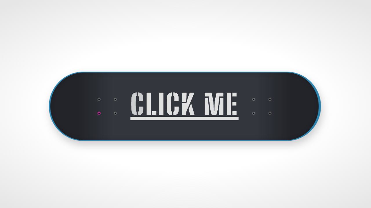
This tutorial will help user to bring flip animation effect for button click. CSS animations are a lot of fun. This tutorial will covers vertical, horizontal and folding button flip animation using css3.
Common CSS for all button flip animation
.buttonHolder{ width: 100px; height: 40px; position: relative; margin: 0 auto 40px; -webkit-perspective: 800px; -moz-perspective: 800px; -o-perspective: 800px; perspective: 800px; }Vertical Button Flip Animation
HTML
<div class="buttonHolder"> <div class="vButtonFlipper"> <!-- Standard button --> <a type="button" class="btn btn-default button1">Default</a> <!-- Indicates a successful or positive action --> <a type="button" class="btn btn-success button2">Success</a> </div> </div>CSS
.vButtonFlipper { -webkit-transition: -webkit-transform 1s; -moz-transition: -moz-transform 1s; -o-transition: -o-transform 1s; transition: transform 1s; -webkit-transform-style: preserve-3d; -moz-transform-style: preserve-3d; -o-transform-style: preserve-3d; transform-style: preserve-3d; height: 100%; } .vButtonFlipper.flipped { position: absolute; width: 100%; -webkit-transform: rotateX( -180deg ); -moz-transform: rotateX( -180deg ); -o-transform: rotateX( -180deg ); transform: rotateX( -180deg ); } .vButtonFlipper a { -webkit-backface-visibility: hidden; -moz-backface-visibility: hidden; -ms-backface-visibility: hidden; backface-visibility: hidden; width: 100%; height: 100%; position: absolute; -webkit-transition: -webkit-transform 1s; -moz-transition: -moz-transform 1s; -o-transition: -o-transform 1s; transition: transform 1s; -webkit-transform-style: preserve-3d; -moz-transform-style: preserve-3d; -o-transform-style: preserve-3d; transform-style: preserve-3d; } .vButtonFlipper .button2 { -webkit-transform: rotateX( 180deg ); -moz-transform: rotateX( 180deg ); -o-transform: rotateX( 180deg ); transform: rotateX( 180deg ); }JavaScript
$( document ).ready(function() { $( ".vButtonFlipper" ).click(function() { $( this ).toggleClass( "flipped" ); }); });Horizontal Button Flip Animation
HTML
<div class="buttonHolder"> <div class="hButtonFlipper"> <!-- Standard button --> <a type="button" class="btn btn-default button1">Default</a> <!-- Indicates a successful or positive action --> <a type="button" class="btn btn-success button2">Success</a> </div> </div>CSS
.hButtonFlipper { -webkit-transition: -webkit-transform 1s; -moz-transition: -moz-transform 1s; -o-transition: -o-transform 1s; transition: transform 1s; -webkit-transform-style: preserve-3d; -moz-transform-style: preserve-3d; -o-transform-style: preserve-3d; transform-style: preserve-3d; height: 100%; } .hButtonFlipper.flipped { position: absolute; width: 100%; -webkit-transform: rotateY( 180deg ); -moz-transform: rotateY( 180deg ); -o-transform: rotateY( 180deg ); transform: rotateY( 180deg ); } .hButtonFlipper a { -webkit-backface-visibility: hidden; -moz-backface-visibility: hidden; -ms-backface-visibility: hidden; backface-visibility: hidden; width: 100%; height: 100%; position: absolute; -webkit-transition: -webkit-transform 1s; -moz-transition: -moz-transform 1s; -o-transition: -o-transform 1s; transition: transform 1s; -webkit-transform-style: preserve-3d; -moz-transform-style: preserve-3d; -o-transform-style: preserve-3d; transform-style: preserve-3d; } .hButtonFlipper .button2 { -webkit-transform: rotateY( 180deg ); -moz-transform: rotateY( 180deg ); -o-transform: rotateY( 180deg ); transform: rotateY( 180deg ); }JavaScript
$( document ).ready(function() { $( ".hButtonFlipper" ).click(function() { $( this ).toggleClass( "flipped" ); }); });Vertical Button Folding Animation
HTML
<div class="buttonHolder"> <div class="foldingButton"> <!-- Standard button --> <a type="button" class="btn btn-default button1">Default</a> <!-- Indicates a successful or positive action --> <a type="button" class="btn btn-success button2">Success</a> </div> </div>CSS
.foldingButton { -webkit-transition: -webkit-transform 1s; -moz-transition: -moz-transform 1s; -o-transition: -o-transform 1s; transition: transform 1s; -webkit-transform-style: preserve-3d; -moz-transform-style: preserve-3d; -o-transform-style: preserve-3d; transform-style: preserve-3d; height: 100%; } .foldingButton.fold { position: absolute; width: 100%; -webkit-transform: rotateX( 90deg ); -moz-transform: rotateX( 90deg ); -o-transform: rotateX( 90deg ); transform: rotateX( 90deg ); } .foldingButton a { -webkit-backface-visibility: hidden; -moz-backface-visibility: hidden; -ms-backface-visibility: hidden; backface-visibility: hidden; width: 100%; height: 100%; position: absolute; -webkit-transition: -webkit-transform 1s; -moz-transition: -moz-transform 1s; -o-transition: -o-transform 1s; transition: transform 1s; -webkit-transform-style: preserve-3d; -moz-transform-style: preserve-3d; -o-transform-style: preserve-3d; transform-style: preserve-3d; } .foldingButton .button2 { -webkit-transform: rotateX( -90deg ); -moz-transform: rotateX( -90deg ); -o-transform: rotateX( -90deg ); transform: rotateX( -90deg ); }JavaScript
$( document ).ready(function() { $( ".foldingButton" ).click(function() { $( this ).toggleClass( "fold" ); }); });