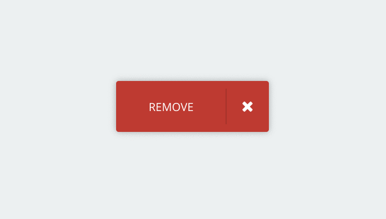
A cool little css Button concept for delete success with hover animation with close/delete icon and developed using CSS, HTML and JavaScript. Demo and download available.
Author Chris Deacy
Created MARCH 20, 2015
License Open
Compatible browsers Chrome, Firefox, Safari
HTML Snippet
`<a class="button" href="#" role="button"> <span>remove</span>
    <div class="icon"> <i class="fa fa-remove"></i> <i class="fa fa-check"></i> </div>
</a>`
CSS Code
`

.button {
    display: block;
    background-color: #c0392b;
    width: 300px;
    height: 100px;
    line-height: 100px;
    margin: auto;
    color: #fff;
    position: absolute;
    top: 0;
    bottom: 0;
    left: 0;
    right: 0;
    cursor: pointer;
    overflow: hidden;
    border-radius: 5px;
    box-shadow: 0 0 20px 0 rgba(0, 0, 0, 0.3);
    transition: all 0.25s cubic-bezier(0.31, -0.105, 0.43, 1.4);
}

.button span,
.button .icon {
    display: block;
    height: 100%;
    text-align: center;
    position: absolute;
    top: 0;
}

.button span {
    width: 72%;
    line-height: inherit;
    font-size: 22px;
    text-transform: uppercase;
    left: 0;
    transition: all 0.25s cubic-bezier(0.31, -0.105, 0.43, 1.4);
}

.button span:after {
    content: '';
    background-color: #a53125;
    width: 2px;
    height: 70%;
    position: absolute;
    top: 15%;
    right: -1px;
}

.button .icon {
    width: 28%;
    right: 0;
    transition: all 0.25s cubic-bezier(0.31, -0.105, 0.43, 1.4);
}

.button .icon .fa {
    font-size: 30px;
    vertical-align: middle;
    transition: all 0.25s cubic-bezier(0.31, -0.105, 0.43, 1.4), height 0.25s ease;
}

.button .icon .fa-remove {
    height: 36px;
}

.button .icon .fa-check {
    display: none;
}

.button.success span,
.button:hover span {
    left: -72%;
    opacity: 0;
}

.button.success .icon,
.button:hover .icon {
    width: 100%;
}

.button.success .icon .fa,
.button:hover .icon .fa {
    font-size: 45px;
}

.button.success {
    background-color: #27ae60;
}

.button.success .icon .fa-remove {
    display: none;
}

.button.success .icon .fa-check {
    display: inline-block;
}

.button:hover {
    opacity: .9;
}

.button:hover .icon .fa-remove {
    height: 46px;
}

.button:active {
    opacity: 1;
}`
JavaScript Snippet
Below js code will add and remove ‘success’ class from the button when button clicked to animate the button.
`(function() {
    var removeSuccess;
    removeSuccess = function() {
        return $('.button').removeClass('success');
    };
    $(document).ready(function() {
        return $('.button').click(function() {
            $(this).addClass('success');
            return setTimeout(removeSuccess, 3000);
        });
    });
}).call(this);`
Preview