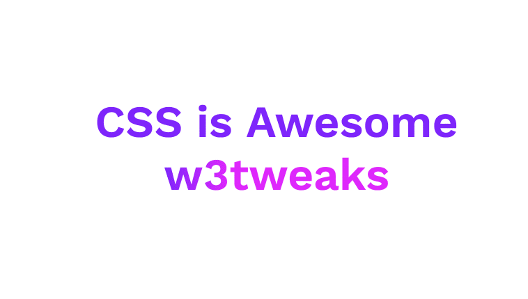
CSS is Awesome. this demo covers text rotation animation using only css. Demo and download available.
Author Joan Leon
Created SEPTEMBER 18, 2018
License Open
Compatible browsers Chrome, Firefox, Safari
HTML Snippet
`<h1 class="awesome">CSS is Aw<span class="eso">eso</span><span class="me">me</span></h1>`CSS Code
`@import url('https://fonts.googleapis.com/css?family=Work+Sans:600'); body { align-items: center; display: flex; justify-content: center; font-family: 'Work Sans', sans-serif; height: 100vh; overflow: hidden; } .awesome { color: #7F00FF; font-size: 10vw; } .eso { animation: rotate 1s forwards ease-in-out 2s; display: inline-block; transform: rotateY(0); } @supports (-webkit-background-clip: text) and (-webkit-text-fill-color: transparent) { .eso { background: linear-gradient(to left, #E100FF, #7F00FF); -webkit-background-clip: text; -webkit-text-fill-color: transparent; } } .me { color: #E100FF; } @keyframes rotate { to { transform: rotateY(900deg); } } @media (min-width: 40em) { .awesome { color: #7F00FF; font-size: 4em; } }`Preview