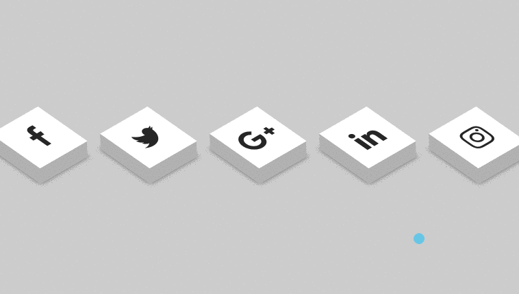
In this article i will show how to create 3d social icons with animation using HTML and CSS. It’s very helpful for most developers to used this type 3d social icons on their blog and its looking very awesome.
Author RAJKUMAR123
Created AUGUEST 24, 2018
Compatible browsers Chrome, Firefox, Safari
Let’s start, as usual first create one HTML file and give some name for that (index.html). after that just copy the below code and execute from your browser.
HTML Code
` <!DOCTYPE html> <html> <head> <meta charset="utf-8" /> <meta http-equiv="X-UA-Compatible" content="IE=edge"> <title>Animated 3D Loading Icon </title> <meta name="viewport" content="width=device-width, initial-scale=1"> <link rel="stylesheet" href="https://cdnjs.cloudflare.com/ajax/libs/font-awesome/4.7.0/css/font-awesome.min.css"> <link rel="stylesheet" type="text/css" media="screen" href="main.css" /> <link href="//maxcdn.bootstrapcdn.com/bootstrap/4.1.1/css/bootstrap.min.css" rel="stylesheet" id="bootstrap-css"> <script src="//maxcdn.bootstrapcdn.com/bootstrap/4.1.1/js/bootstrap.min.js"></script> <script src="//cdnjs.cloudflare.com/ajax/libs/jquery/3.2.1/jquery.min.js"></script> <script src="main.js"></script> <style> body{ margin: 0; padding: 0; background-color: #ccc; } ul{ position: absolute; top: 50%; left: 50%; transform: translate(-50%, -50%); margin: 0; padding: 0; display: flex; } ul li{ list-style: none; margin: 0 40px; } ul li .fa{ font-size: 40px; color: #262626; line-height: 80px; transition: .5s; } ul li a{ position: relative; display: block; width: 80px; height: 80px; background-color: #fff; text-align: center; transform: perspective(100px) rotate(-30deg) skew(25deg) translate(0,0); transition: .5s; box-shadow: -20px 20px 10px rgb(0, 0, 0, 0.5); } ul li a::before{ content: ""; position: absolute; top: 10px; left: -20px; height: 100%; width: 20px; background: #b1b1b1; transition: .5s; transform: rotate(0deg) skewY(-45deg); } ul li a::after{ content: ""; position: absolute; top: 80px; left: -11px; height: 20px; width: 100%; background: #b1b1b1; transition: .5s; transform: rotate(0deg) skewX(-45deg); } ul li a:hover{ transform: perspective(1000px) rotate(-30deg) skew(25deg) translate(20px, -20px); box-shadow: -50px 50px 50px rgb(0, 0, 0, 0.5); } ul li:hover .fa{ color: #fff; } ul li a:hover{ transform: perspective(1000px) rotate(-30deg) skew(25deg) translate(20px, -20px); box-shadow: -50px 50px 50px rgb(0, 0, 0, 0.5); } ul li:hover:nth-child(1) a{ background: #3b5999; } ul li:hover:nth-child(1) a:before{ background: #2e4a86; } ul li:hover:nth-child(1) a:after{ background: #4a69ad; } ul li:hover:nth-child(2) a{ background: #55acee; } ul li:hover:nth-child(2) a:before{ background: #4184b7; } ul li:hover:nth-child(2) a:after{ background: #4d9fde; } ul li:hover:nth-child(3) a{ background: #dd4b39; } ul li:hover:nth-child(3) a:before{ background: #c13929; } ul li:hover:nth-child(3) a:after{ background: #e83322; } ul li:hover:nth-child(4) a{ background: #0077B5; } ul li:hover:nth-child(4) a:before{ background: #036aa0; } ul li:hover:nth-child(4) a:after{ background: #0d82bf; } ul li:hover:nth-child(5) a{ background: linear-gradient(#400080, transparent), linear-gradient(200deg, #d047d1, #ff0000, #ffff00); } ul li:hover:nth-child(5) a:before{ background: linear-gradient(#400080, transparent), linear-gradient(200deg, #d047d1, #ff0000, #ffff00); } ul li:hover:nth-child(5) a:after{ background: linear-gradient(#400080, transparent), linear-gradient(200deg, #d047d1, #ff0000, #ffff00); } </style> </head> <body> <ul> <li><a href="https://www.facebook.com/profile.php?id=100012512077239"><i class="fa fa-facebook" aria-hidden="true"></i></a></li> <li><a href="#"><i class="fa fa-twitter" aria-hidden="true"></i></a></li> <li><a href="#"><i class="fa fa-google-plus" aria-hidden="true"></i></a></li> <li><a href="https://www.linkedin.com/in/raj-kumar-web-designer/"><i class="fa fa-linkedin" aria-hidden="true"></i></a></li> <li><a href="#"><i class="fa fa-instagram" aria-hidden="true"></i></a></li> </ul> </body> </html> `Preview